AllinOne
Shopping application for a local store
Me working as the UX/UI designer | UX researcher & User Interaction designer
Using Figma, Adobe Ps & Miro to present my idea in 5 weeks
‘All in one’ is a project that I did as the first case study for my Google UX/UI Design Certificate. It is a shopping application for a local store, located in Mclean,Virginia. It sells a variety of products and food. The app is designed for local people to shop online confidently, while avoiding the crowded stores and long checkout lines.
Project overview
What is the problem?
Many people prefer online shopping over in-store shopping for different reasons. Because they are too busy to find time for in-person shopping. Or they need to avoid crowded indoor areas due to health conditions or many other reasons. In addition to it, online shoppers face hesitation and uncertainty while working with an online shopping application. During this project I worked on some challenges of online shopping and found solutions to make the process more accessible.
What is the goal?
Our online shopping application should help users have an easy and quick shopping experience which will affect people who prefer
online shopping. By letting them avoid the time-consuming process of in-store shopping and crowded indoor areas. We will measure effectiveness by calculating the number of people who use the app on a regular basis.
Understanding the user
User research summary
At the Emphasize stage of the project I conducted research about challenges that people are facing while using shopping applications. I conducted user interviews as my foundational research method to collect in-depth information on people’s experiences. I have interviewed people who did most of their shopping’s online.The main part of the challenges were about shopping applications not providing thorough information about the product. In the other hand interviewees claimed that the product that they bought online didn’t look like what they thought it would, in real.Some claimed that the shopping process is too hard and time consuming for them to handle, with a bunch of useless information at each page that distracts their attention from the main actions. I will point out some user pain points in the following.
User interviews
To empathize with target users, I conducted interviews as my foundational research method to collect in depth information on
their opinions, thoughts, experiences, and feelings.(qualitative data). I interviewed people who were looking for a change in their professional journey for different reasons. I learned about their needs and pain points.
Interview goals:
-
What common challenges do people face in the process of online shopping?
-
What do people expect from online shopping?
-
How effective is the design of a shopping application on the desire of people for choosing the store?
-
What makes users frustrated while shopping online?
-
What makes them more interested in a specific shopping applications?
Target participant characteristics:
-
They are ages 18 and older.
-
They all live in the US.
-
People who shop online at least once a week.
-
They are from all genders and abilities.
User pain points:
In the following I will elaborate on three of the main users' pain points (based on my interviews ) that I worked on during this project.
-
"It is frustrating when I can't find enough information about a product that I want to buy"
-
User can not find enough information about a product before buying it.
-
“It is disappointing when when I get my products and they have different color or different quality than what I expected”
-
User misunderstands the provided information.
-
“I need to know other users’ opinions about a product that I want to buy, I get frustrated and just leave the Shopping website when I don’t find any costumer feedbacks.”
-
User needs assurance before purchasing the product.
User personas and journey maps



Problem statements
Zara is a busy working mom who needs access to an online shopping application which provides easy convenient and quick shopping options. Because they don’t have enough time for in-person shopping in their family.
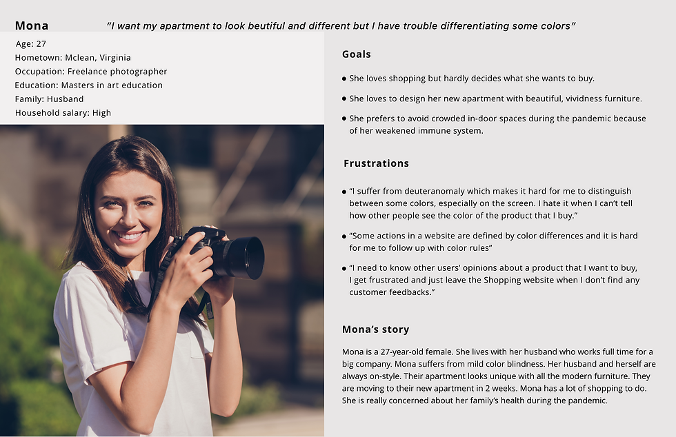
Mona, a freelance photographer who cares about her family's health during the pandemic, needs an online shopping application that is color accessible. Because she suffers from mild color-blindness and usually doesn’t have help when it comes to shopping.
Ideating
I started designing my app by wireframing on paper. The next step for me was to build digital wireframes. I tried to apply what I learned from my primary research to my wireframe designs. I worked on a few key features of my application up to this point. And tested them with real users to get useful feedback.
Competitive audit
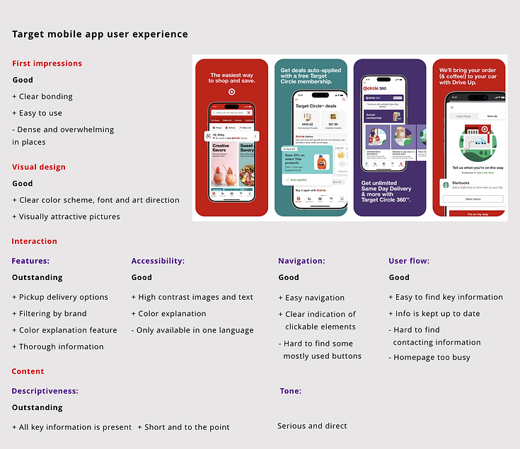
Competitive audit goal: to compare the shopping experience of each competitor's app.
What I learned from competitive audit:
I studied my competitives' strenghts and weaknesses and realized what features makes the user experience of a mobile app more pleasent and what makes the experience frustrating and overwhelming. I considered these understandings in my own design.
UX design storyboards
Big picture storyboard
Scenario: Use the local shop's application to shop quickly and easily


1
2
3
4
5
6
-
Mona is moving to her new apartment and needs new furniture.
-
She gets nervous to go to crowded indoor places because of the pandemic.
-
She finds and downloads the shopping application of her local store.
-
Mona is happy to look for her desired furniture in an application.
-
Mona is happy to choose her furniture with no frustration because the app is color accessible.
-
Mona's furniture is delivered and she is happy with its color.
Close up storyboard
Scenario: Use the local shop's application to shop quickly and easily



1
2
3
4
5
6
-
Mona opens up the app.
-
Mona chooses the "shopping"option immediately.
-
Mona recognizes her desired category quickly by its picture.
-
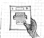
Mona clicks "color details" to know more about the furniture's color.
-
Mona checks the color in different lightings and chooses her desired color by checking the text below it.
-
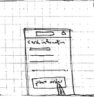
She places her order quickly because the app has saved her information before.
Defining the goal
Goal statement
"Our online shopping application will let users have an easy and quick shopping experience which will affect people who do not often go in-person shopping. By letting them skip the time-consuming process of in-person shopping or crowded indoor areas."
We will measure effectiveness and satisfaction rate by:
- Calculating the number of people who use the application to shop, on a regular basis.
- Calculating the amount of time, people put on completing a shopping task.
- Calculating the number of people who are satisfied after the delivery of their product.
Starting the design
I started designing my app by wireframing on paper. The next step for me was to build digital wireframes. I tried to apply what I learned from my primary research to my wireframe designs. I worked on a few key features of my application up to this point. And tested them with real users to get useful feedback.
Digital wireframes
1. Easy Navigation
I tried to design the homepage in a way to be easily read and I located the navigation tools in a place to be accessible from every page. My goal was to make everything look easy to find for the user so that it is less time-consuming. I tried to include graphics and pictures to make the homepage fun and engaging.
-
Both list and cart are accessible from top of the page.
-
The main action for the app has meant to be highlighted by the size difference of its font and the button’s properties in the frame.
-
Navigation menu is designed to accommodate the main actions at every page to avoid confusion.
-
User can check and change her store with this button.
-
These buttons are designed to provide additional information about the product.
-
The "design tips" section provides interior architecture tips. which will be a paid service

3
1
2
4
5
6
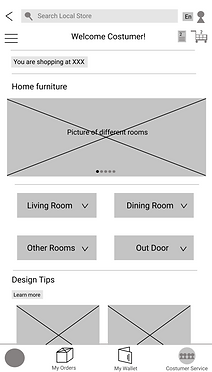
Digital wireframes
2 . Color accessibility
I designed the “product description” page in a way to provide thorough information about the product. The app is designed to provide additional information about color and lighting to avoid misunderstanding and to be color accessible.
-
Gives users the opportunity to see the product in different lightings.
-
Provides interior design tips for colors that match the chosen product's color.
-
A brief description about the color of the product.
-
Provides easy access to the payment page.
1
2

3
4
Digital wireframes
3 . Customer reviews
I designed the “product description” page in a way to provide thorough information about the product. The app is designed to provide additional information about color and lighting to avoid misunderstanding and to be color accessible.
-
Gives users the opportunity to see the product in different lightings.
-
Provides interior design tips for colors that match the chosen product's color.
-
A brief description about the color of the product.
-
Provides easy access to the payment page.
1
2

3
4
User flow and low fidelity prototype
-
Open app
-
Home screen
-
Choose your category for shopping
-
Subcategorie
-
Choose your sub-category for shopping (Repeat until there is no other sub-category)
-
List of Products
-
Filtering and sorting
-
Choose a product
-
Details Add to list
-
Select a product from here? Yes No
-
Product information
-
Decide to buy? Yes No
-
Customize
-
Add to cart
-
Select ship to my address Select pickup
-
Select location and date/time for pickup
-
Insert checkout information
-
Make payment? Yes No

Usability study
I conducted unmoderated usability studies to figure out if the design methods applied to this application leads people to easy shopping and making quicker decisions with more confidence.
I asked Five participants to complete the task of buying a sofa in the shopping app. Participants are people who shop online at least twice a week because of different reasons. 2 males, 2 females all aged 20-75 years old. One of the users suffers from mild color blindness.
UX research study plan in detail
-
Study type: unmoderated usability study
-
Location: remote, using Zoom
-
Length: 20-30 minutes
Users' pain points and insights
Usability study note taking spreads
-
3 out of 5 users couldn’t easily find the “shop by category” Button.
-
An insight is to design the homepage in a way that navigation gets easier.
-
4 out 5 users hardly found the search bar.
-
An insight is to change the properties of the search bar.
-
4 out of 5 users couldn’t interact with the color and lighting button. But got excited about it, when figured it out.
-
An insight is to design the color and lighting feature in a way that makes it easier and more engaging to use.
-
3 out of 5 users got confused about the date and time of delivery or pickup.
-
An insight is to make the pickup and delivery information accessible for users.
-
4 out of 5 users got annoyed when the order was placed before reviewing the order.
An insight is to design an “order review” page that shows up before placing the order.
-
3 out of 5 users got frustrated by clicking too much buttons to get to the sofa page.
An insight is to make it easier and less time-consuming for users to get to the product's page.
Refining the design


Make the navigation easier
I changed the design of the homepage in a way that the main action stands out more clearly. Due to usability study, users had trouble finding the "shop by category" button or the search bar. With the new design it is more likely that users can navigate more easily through the app and find what they need from the homepage.
1

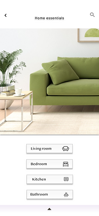
To make the app navigation more clear I decluttered the "Home furniture" page and filled it with necessary information. I organized the contents by the type of room and added a logo in front of each title to make it more accessible for those who have any difficulties with reading.


Eliminate time consuming tasks
Before the usability study users had to click too many buttons to get to the page that they needed and it was time- consuming. in the new design user only clicks on the type of room she needs and a page with sortable and filterable information opens. At this page I also provided a brief description about shipping and delivery options.
2


Make the "color and lighting" feature stand out in the app.
Users believed that the "color and lighting"feature is new and interesting but is not easy to interact with. so made it more noticeable by removing the separate page for color and lighting and designing the feature as interactive buttons and placing it in the product explanation page.
3


Redesign the "cart" page to include accurate "pickup and delivery" information.
Users claimed that pickup and delivery date and time is not clear in the app so I included this information in the "My cart" page. Also I added links to share the
4
High fidelity prototype

Accessibility considerations
-
This app is designed to be accessible to people who suffer from color blindness. The description about the color of the product and the option of viewing the product in different lightings helps to get close to this goal. Also, there is no action In the app that is defined by color only.
-
This app is designed to be accessible to people who hardly understand English. Or have difficulties reading long texts. Every action has been defined with a graphic icon to be understandable. Clear high-quality photos also help them navigate the app easier and quicker.
Future steps for this project
-
I am looking forward to designing the ‘build your own room” button for the app. Which is an innovative feature that helps users decorate their room with different objects that they choose from the store to check color matchings and size in the application. It helps them get a more real sense from the product and make their purchase more confidently
-
I am looking forward to using pictures and graphic icons more frequently in the application so that it gets accessible for people who have difficulty reading long texts.
.jpeg)
